Supporting materials
Info sheet: Advanced concepts and data relationships
Sample data for plotting an H-R diagram
Download
Download this article as a PDF


From notebook sketches to space-telescope data: explore how mapping starlight using the Herzsprung-Russell (H-R) diagram helps us trace the life stories of stars across the universe.
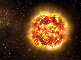
Some stars blaze blue, others glow red. Some shine brilliantly, dominating the night sky, while others barely flicker. If you could draw the life story of every star in the universe, what would it look like?
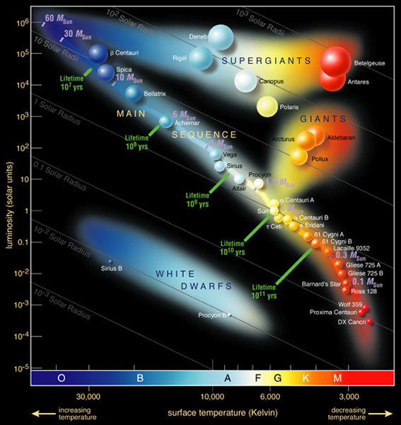
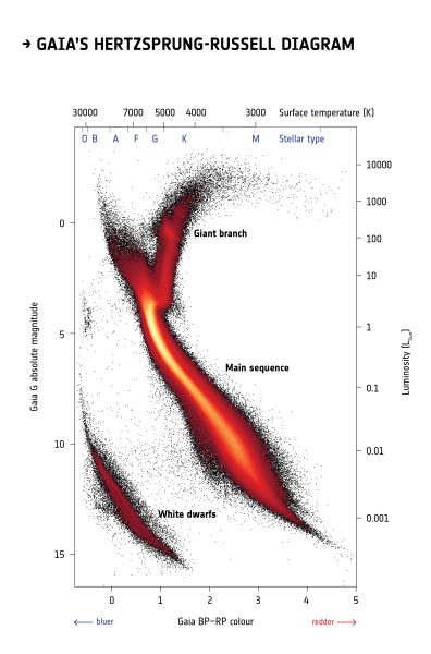
Astronomers answer this question with a remarkable tool: the Hertzsprung-Russell (H-R) diagram, often described as “astronomy’s map of the stars”. Developed over a century ago by Ejnar Hertzsprung and Henry Norris Russell, this simple diagram shows the luminosity of a star against their surface temperature, revealing hidden patterns that explain how stars are born, evolve, and die.[1] Learn more about the historical background of the Hertzsprung-Russell diagram in info sheet 1: historical roots.
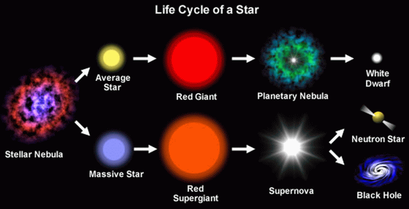
Each point on the diagram represents a star at a particular stage in its life. As stars evolve, they move across the chart along different paths depending on their mass. For example, some stars move from the bright, hot regions of young blue stars towards cooler regions of the diagram, where they may evolve into red giants and eventually end their lives as white dwarfs.
In this activity, students will learn how to build their own H-R diagram using real stellar data – just like astronomers do. They will thereby discover how a single chart can unlock the grand story of our galaxy, from nearby stars to the discoveries made by the Gaia space mission, an ESA observatory mapping the Milky Way.[2]
The estimated duration for this activity is 20–25 minutes.
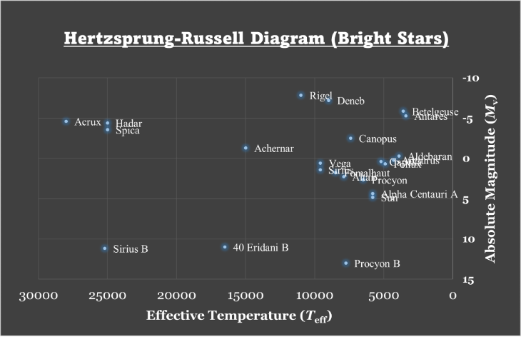
In activity 1, students recreate their own H-R diagram using real data from 10–20 well-known stars, such as the Sun, Sirius, Vega, Betelgeuse, and Rigel.
The activity can be done in different ways:
In activity 2, students trace the evolutionary track of the Sun on the H–R diagram. The evolutionary track is the path a star follows on the H-R diagram as it ages and changes in temperature and brightness.
Estimated time: 20–25 min
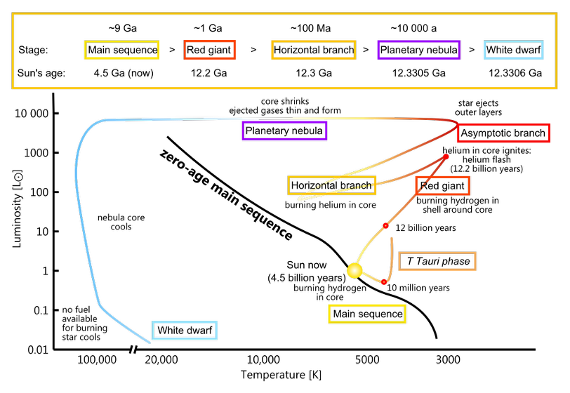
Now that the students have plotted the stars and observed the patterns, it’s time to understand what the diagram reveals about the life of each star. The clusters and sequences that the students discovered are more than just points on a graph. They reveal fundamental properties of stars and how they evolve.
The H-R diagram plots stellar surface temperature against luminosity, which represents the total energy output of a star per unit time and reflects its intrinsic brightness. Temperature (or spectral type) is plotted on the x-axis and luminosity (or brightness compared to the Sun) is plotted on the y-axis. Despite only having these two quantities, every point on the diagram carries hidden information about the star’s colour, size, and stage of life.
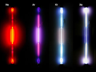
Astronomers never measure a star’s temperature directly. Instead, they analyse how much light the star emits in different colours, also known as its spectrum. From these colour patterns, they can infer the star’s temperature, classify it, and place it on the H-R diagram.[3]
Each star’s position on the H-R diagram is largely determined by its mass, which dictates how it lives and dies. More massive stars live fast and die young, while smaller stars like the Sun evolve slowly and end quietly. The main sequence on the H-R diagram is like a stellar highway, showing stars of different masses in the prime of their lives. The clusters of red giants and white dwarfs represent what happens when stars leave that highway.
By reading the H-R diagram, the life story of stars can be followed:
The plotted activity demonstrates these stages visually, showing how stars move across the diagram as they age.
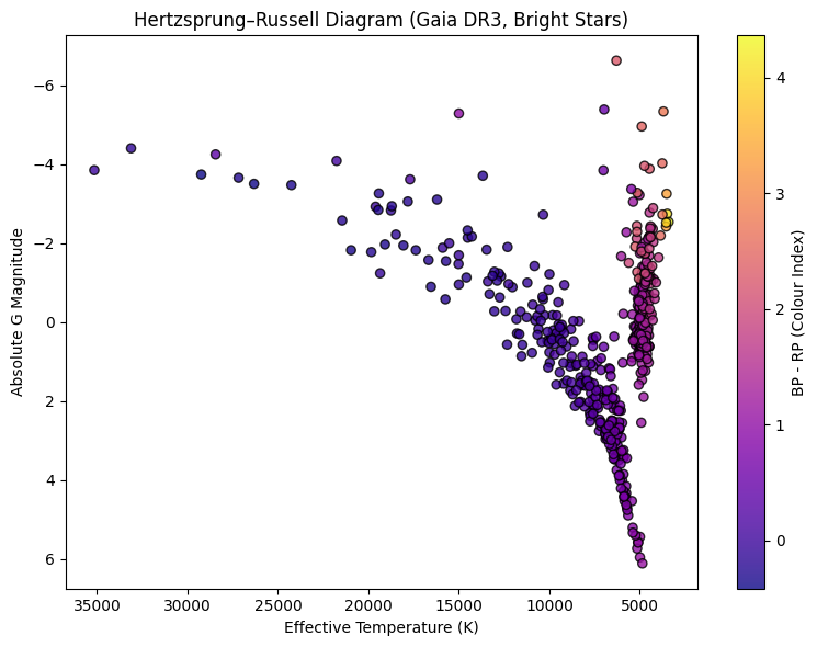
After plotting their own H-R diagrams, students have seen how patterns emerge in star brightness and colour. Now imagine doing this for over two billion stars! That’s exactly what astronomers using ESA’s Gaia mission have achieved.[2]
The Gaia mission, a European Space Agency project mapping the positions, distances, and motions of over two billion stars in the Milky Way, has produced the most detailed H-R diagram ever made. Using data from Gaia Data Release 2, astronomers plotted more than four million stars located within 5000 light-years of the Sun (Data Release 2).[4] Compared with the earlier Hipparcos data, Gaia’s diagram reveals remarkable new features: a thin main sequence, binary star tracks, red clumps of helium-burning stars, and even splits in white dwarf branches.[4,5]
By selecting stars based on their proper motion, astronomers can separate the galaxy’s main populations:
Gaia has even shown that our galaxy isn’t static: it ripples and wobbles, like a giant wave spreading from its centre (like a pebble dropped in water). By comparing your small H-R diagram with Gaia’s billion-star map, you can see how simple data visualization uncovers profound patterns and grows into cosmic discovery.[7] It shows how age, composition, and motion shape the Milky Way, and that stars are not randomly scattered but follow physical laws dictated by mass, energy, and time.
The following activity takes 15–20 min.
Encourage students to think about the patterns they uncovered and what they reveal about the way science works. Possible answers to these questions are included in the activity 3 answers sheet.
[1] Introduction to the H-R diagram: https://www.cosmos.esa.int/web/cesar/the-hertzsprung-russell-diagram
[2] The Gaia mission by the European Space Agency: https://www.esa.int/Science_Exploration/Space_Science/Gaia
[3] Video on how to construct H-R diagrams: https://science.nasa.gov/asset/hubble/constructing-the-hertzsprung-russell-diagram-for-globular-star-cluster/
[4] Brown AGA et al. (2018) Gaia Data Release 2: Summary of the contents and survey properties. Astronomy & Astrophysics 616. doi: 1051/0004-6361/201833051
[5] A Gaia Hertzsprung-Russell diagram from 2018: https://www.esa.int/ESA_Multimedia/Images/2018/04/Gaia_s_Hertzsprung-Russell_diagram
[6] Hertzsprung-Russell diagrams from Gaia Data Release 2: https://www.cosmos.esa.int/web/gaia/gaiadr2_hrd
[7] The galaxy’s great wave discovered by the Gaia mission: https://www.esa.int/Science_Exploration/Space_Science/Gaia/Gaia_discovers_our_galaxy_s_great_wave
This article is a good opportunity for teachers and students to learn about stellar astrophysics through one of the most iconic relations: the Hertzsprung-Russell Diagram (H-R diagram). This simple relationship allows astrophysicists to study the life cycle of stars and to understand their physical and chemical evolution through the years, ultimately providing insight into the history of galaxies and the Universe itself.
The diagram can be used to explain and emphasize the students’ knowledge of math. How can they create a graph and interpret the information it contains? More advanced students can also use their programming skills to start learning how to create plots using programming languages. It gives students the chance to understand how a star works and how it evolves chemically. To relate to other fields, it can also be used to explain why we would prefer to build fusion reactors rather than fission ones, as this is easily understandable when you see how stars produce their energy. It is also useful for medicine and spectroscopy applications, which are useful for studying and characterising materials. This helps to reinforce concepts of light and the electromagnetic spectrum and their applications in everyday devices.
Jorge Andrés Villa Vélez, CERN, Switzerland/France
Info sheet: Advanced concepts and data relationships
Sample data for plotting an H-R diagram
Download this article as a PDF
Find out how we know what the Sun (and stars) are made…


Written in the stars: use microcontrollers and LEDs to model stellar life cycles, scaling billions of years into minutes while exploring stellar evolution.
Péter Székely from the University of Szeged, Hungary, and Örs Benedekfi from the European Fusion Development Agreement in Garching, Germany,…


