


Graphing stories Teach article
This activity was presented at the Science on Stage Festival 2022 ![]()
Sketch graphs from ‘story’ videos of everyday events to help students understand the basic features of graphs and how to interpret them.
The idea of graphing stories is simple. Students are shown a short film of an everyday event, such as a glass filling with water, a piece of salmon cooking in the oven, or a bike moving down a hill. The students are then prompted to sketch a graph that describes the event, for example, how they think the height of the water, the temperature of the salmon, or the speed of the bike changes over time. These sketches become the starting point for a classroom discussion, which ends with the correct graph being shown.
Below is an example of a graphing stories video.
To draw the graph describing the rising temperature of the salmon in the oven, students will have to think about the start and end points of the graph and what shape the graph will take in between those points. Is it going to be a straight line or a curve? This approach thus focuses on the graph’s global features. In this way, the activity complements lessons where students construct graphs point by point, for instance, lessons where students conduct their own experiments, collect data, and visualize data graphically.
This story-graphing routine was pioneered by the American maths educator Dan Meyer. It’s suitable for students aged 13-19 and graphing a single story typically takes about 10-20 minutes.
How to use the graphing stories videos
Materials
- Students will need pencils and squared paper.
- The story videos can be accessed here.
Procedure
- Show the first part of the film to the students. Pause the film after the coordinate system is displayed and relevant variables are visible on the axes. Explain that students should draw a graph of the event, describing the relationship between the two variables.
- Explain to the students that they do not have all the information needed to draw the graph, so they will have to make some assumptions and estimates. In the story above, for instance, the students need to estimate how long it took to cook the salmon.
- Give students time to draw a coordinate system in their notebooks. Depending on prior knowledge, it may be necessary to clarify which variables are to be plotted on each axis and which scale the axes could have. You can also choose to hand out ready-made graphing paper. If the students don’t require scaffolding, it is a good exercise for them to draw their own coordinate system and choose a suitable scale.
- Restart the film to show the event once more. Depending on the nature of the story, it may be necessary to play the film several times or to play it at a slower speed. If students have their own computers, you can choose to give them access to the film, so that they can watch it several times and pause if necessary.
- Give students time to draw the graph. Walk around the classroom and observe the students’ work. Students who have difficulty getting started can be advised to first describe the relationship between the variables in words, for example, “I think the salmon’s temperature increases at a steady pace”. Once a hypothesis is formulated in words, it is often easier to transfer this idea to a graph. It can be helpful for the students to work in pairs.
These three questions are also a good way to support students:- At what point should the graph begin?
- At what point should the graph end?
- What do you think the graph looks like in between?
- Select a few graphs that show different mathematical ideas to compare in a whole-class discussion. For example, you can select graphs that have different shapes, the same shape but different start and end points, or different scales on the axes. Look for graphs that manifest common misconceptions.
- Present the selected graphs to the class. Students can describe their graphs orally, as you draw them on the board, or students can come forward and draw their graphs on the board. A camera and projector or a digital submission system are other possibilities.
- Guide the class discussion to help students understand the key features of their suggested graphs and how these relate to the event shown in the video. See Discussion.
- Give students time to revise their graphs based on what they learned during the discussion. By emphasizing that the first graph is a draft, it becomes less risky for the students to be wrong. This, in turn, can increase participation in the class discussion.
- Restart the video and show the correct graph. Discuss any similarities and differences between the correct graph and the students’ suggestions. This can lead the students to conclusions such as
“We thought it took 20 minutes to cook the salmon, but it took longer than that!”
“It seems that the salmon’s temperature increased fastest around the middle of the cooking time. I did not think so!”
“I thought the salmon’s temperature increased linearly, but it didn’t.”
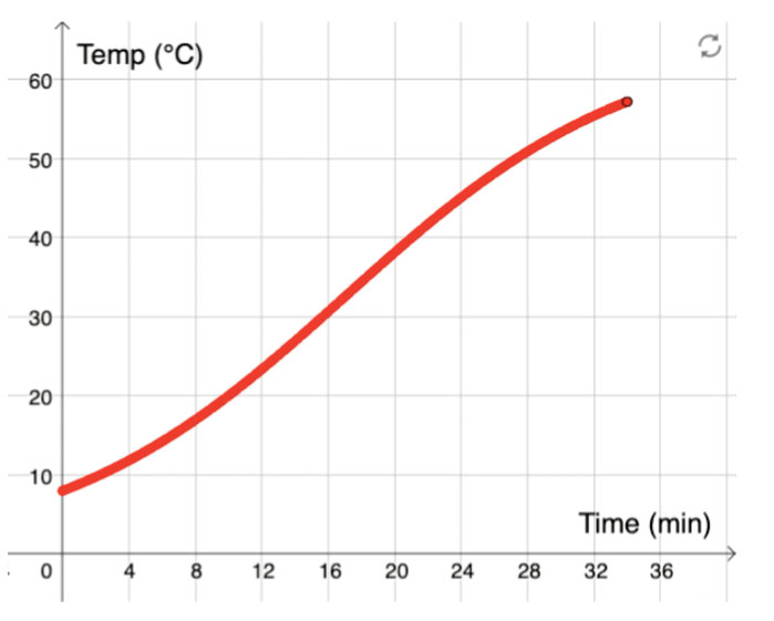
Image courtesy of Emelie Reuterswärd
Discussion
A good way to guide the class discussion after the first round of graph sketching is to compare two graphs and encourage the students to describe their similarities and differences.
For example, the graphs below show two possible descriptions of how the salmon’s temperature increases while it is cooking in the oven.
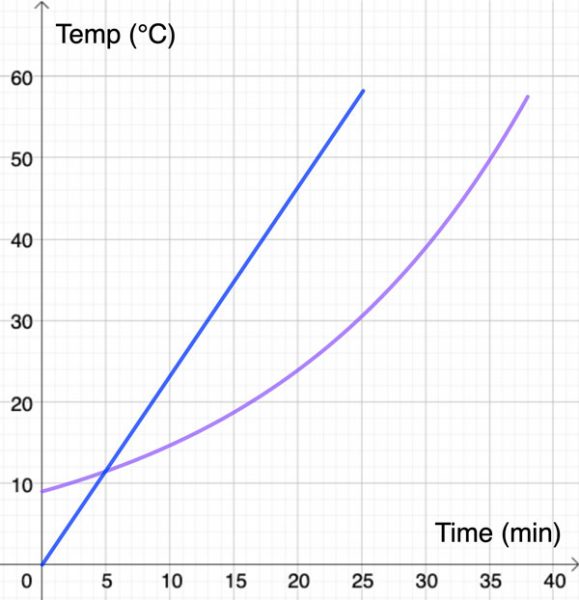
When students compare these graphs, they might note that:
- the blue graph starts at the origin, while the purple graph has a higher y-intercept;
- the student who has drawn the purple graph thinks that it takes longer for the salmon to cook;
- the blue graph shows that the salmon’s temperature increases at a steady pace, while the purple graph shows that the salmon’s temperature increases faster at the end.
By reformulating students’ statements using mathematical vocabulary, you can introduce important mathematical concepts, such as ‘linear’, ‘slope’, and ‘domain’.
Another way to take the classroom discussion further is to focus on different parts of the graph and let the students explain their thinking: Why does the graph not start at the origin? Why did you choose that scale? Why is the graph steeper at the end?
Ideas for expanding the task
Once you have completed a story, there are several ways to expand the task. Students can be asked to determine the equation that describes the graph or to determine the function’s domain and range. You can also follow up by asking “What happens if?”. For the salmon example, such questions could include
- What would the graph look like if we cooked a smaller piece of salmon? A bigger one?
- What would the graph look like if we put in a frozen piece of salmon?
- What would the graph look like if we left the salmon longer in the oven?
Encouraging students to ask these kinds of questions trains them to explore the characteristics and limitations of a mathematical model and shows them how to think like a mathematician.
It is also effective to work with several stories in a row. That way, you can compare and contrast different graphs and make connections between different mathematical concepts. For instance, the story ‘bike speed’ prompts students to graph the speed of a bike as a function of time, as the bike moves down a hill, slows down, and eventually comes to a stop. The graph turns out to be an almost perfect parabola. But what about the graph describing the distance travelled as a function of time? This question is answered in the story ‘bike distance’. By letting students work with both of these stories, they can make connections between concepts such as derivative and primitive functions.
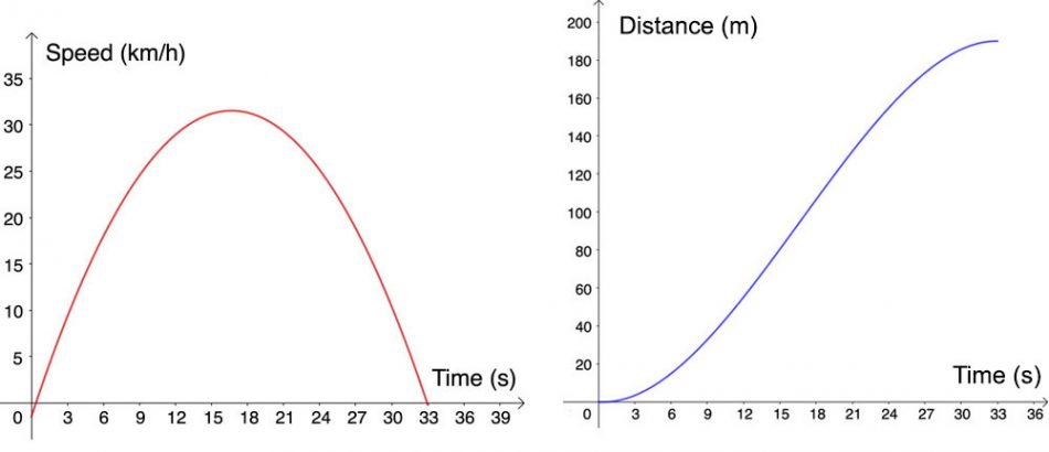
Image courtesy of Emelie Reuterswärd
As an extension, you can let your students create their own stories for graphing using their mobile phones. This encourages them to see the mathematics in everyday events and to describe them with a mathematical model. In secondary school, the films can explore phenomena in other subjects, such as physics or vocational subjects. In this way, the students’ films can become the starting point for an interdisciplinary learning activity.
Why use graphing stories?
There are several reasons to work with graphing stories.
- Students experience how graphs are used to describe everyday phenomena. It connects mathematics to students’ reality and allows them to see the usefulness of mathematics.
- The classroom discussion of the students’ graphs creates a need to formulate what the students have drawn. This provides an opportunity to introduce important concepts, such as slope, linear, constant, increasing, and decreasing. In upper secondary school, you can use graphing stories to discuss more advanced concepts, such as derivatives, inflection point, and maximum.
- After working with several different stories, a natural step is to compare the graphs and categorize them. Thus, graphing stories is an excellent tool for introducing and naming relationships, for example, linear, quadratic, periodic, and exponential.
- In lower secondary school, it is common to work mainly with linear relationships. With the help of graphing stories, you can show students that there are other types of relationships, the graphs of which are not straight lines.
- The sketching of graphs of everyday events is a common task in many textbooks. Letting students see a film of the event makes it more concrete, which can make it easier for students to draw the graph. In addition, the connection between the event and the graph becomes stronger.
- Drawing graphs of everyday events is a challenging task that can often uncover hidden misconceptions. For example, students often struggle to find a suitable scale and fail to equally space the quantities along the axis. Having to reason things through rather than just plotting data can often uncover hidden misconceptions.
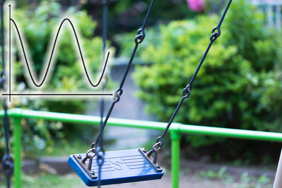
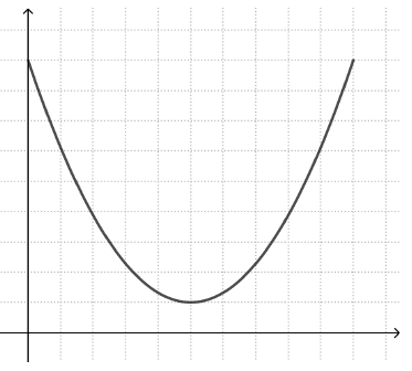
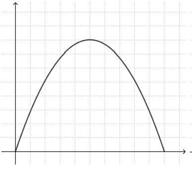
The last point is a particular strength of this approach. One common misconception is so-called ‘iconic’ representations of graphs. This means that the student sees a correspondence between the shape of the graph and a visual feature of the described event. For example, students working with the story ‘bike speed’ may draw a graph that resembles the shape of the valley the bike rode through (left graph), instead of a parabola with a maximum point (right graph).
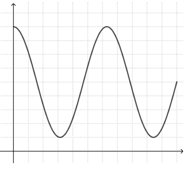
Similarly, a student trying to draw a graph of how the height of a moving swing changes with time may draw a graph that resembles the swing’s movement back and forth (left graph), rather than a periodic graph that alternates between high and low y values (right graph).
Graphing stories makes such misconceptions visible and provides excellent opportunities for students to discuss and overcome them.
Resources
- Read more about graphing stories and access the story videos at matemagi.com/graphingstories
- Explain exponential growth to your students through these simple exercises: Vieser W (2021) Exponential growth 1: learn the basics from confetti to understand pandemics. Science in School 53.
- Learn about exponential growth and how it relates to real-world problems like the spread of infectious diseases: Vieser W (2021) Exponential growth 2: real-life lessons from the COVID-19 pandemic. Science in School 53.
- Read about the importance of statistics and correct data analysis: Le Guillou I (2021) Clinical trials count on more than statistics. Science in School 52.
- Engage your students and demonstrate fundamental physics with everyday objects: de Winter J (2022) Physics with everyday objects: springy sweets, a universe in your pocket, and drawing circuits. Science in School 56.
Institutions
Science on StageReview
This article is about graphing stories. The students are shown a short film of an everyday event, such as a glass filling with water, and are asked to draw a graph of the event. These sketches are discussed as a class. This approach should help them to develop a better understanding of the concepts of a graph. Interestingly, no text is spoken or displayed in the films. This makes this approach particularly suitable for language-disadvantaged students. If the teacher pays attention to (mathematical) vocabulary when discussing the graphs, the students can improve their language skills as well.
Annemiek van Leendert, Math teacher, Royal Visio, the Netherlands